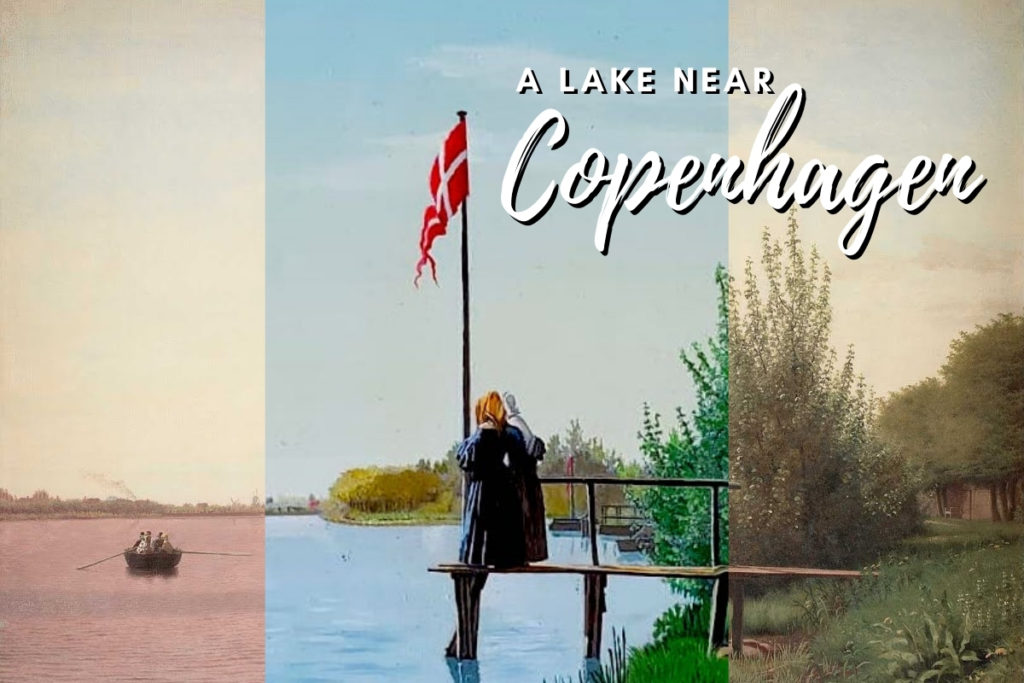
A Lake Near Copenhagen
My father was a master forger. Not really, but his retirement hobby was creating small replicas of paintings. He was very good at it. The walls in my parent’s home in Nova Scotia were and still are covered with paintings, stacked one above another, like in an old-time gallery. When I visited, my father encouraged me to select half a dozen or more and he would then ship them to my home in Manitoba. He became very prolific and there were always new ones to choose from. My walls are full, and I have given them away as gifts to friends, with others still in boxes. After a prolonged pandemic pause, I was recently at my parent’s home again to visit my mother. Looking at the paintings was like greeting old friends. In a spirit of nostalgia, I decided to take one home with me and selected A Lake Near Copenhagen.
I have written before how art takes us on journeys. A Lake Near Copenhagen did so too, although more in a figurative sense. It all began when I decided to learn a little more about the painting.
Not Really a Lake Near Copenhagen
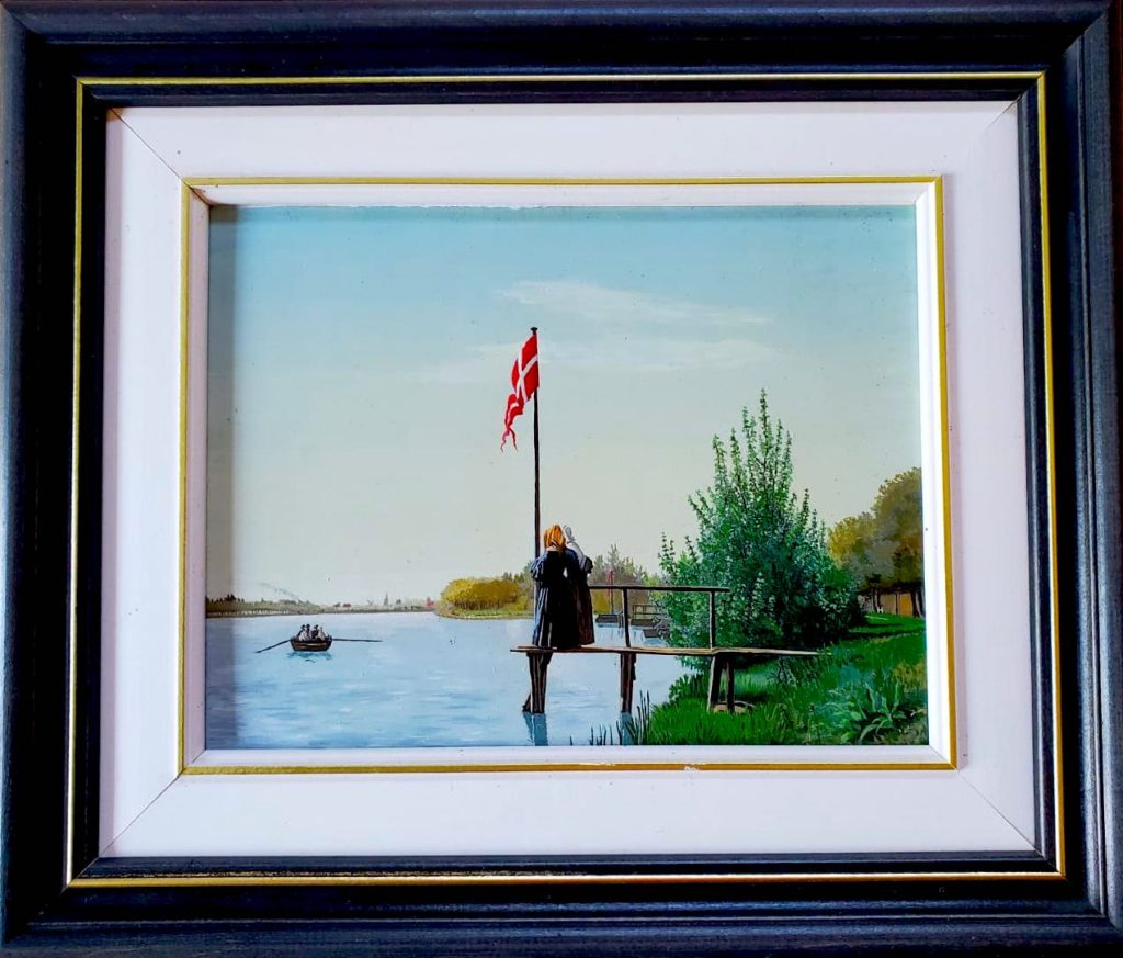
While my father had labelled the painting on the back as A Lake Near Copenhagen, the correct title is A View of Lake Sortendam from Dosseringen looking toward the Suburb Norrebro Outside Copenhagen. Painted in 1838 by Christen Købke, a pre-eminent painter of the Danish Golden Age, the painting is a lovely scene of two women on a short jetty looking at a rowing boat, with the Danish flag prominent.
I checked the location of the lake. Maybe back then it was in a suburb with trees and fields surrounding it. Today it is very firmly urban, with the reedy shores in the painting replaced by concrete. Maybe I have even seen it, although I don’t specifically recall. Just 600 m away from the lake is SMK, the national gallery of Demark, which I have visited and where the painting hangs.
Turns out that life in Denmark was not nearly as idyllic as the painting intimates. The country was enduring a period of financial difficulty at the time, Nelson having defeated its army, plunging the country into bankruptcy. While it is often useful and interesting to understand the history and context in which art is created, in this case it is perhaps not significant. What matters is the beauty of the painting and the emotions that it invokes.
It’s a really beautiful and well-composed picture. As spectator, you can step into it without being disturbed, and if you’re visiting SMK to find highlights of Danish art, culture, identity and history, then this is certainly a must-see. It is also an image of Denmark that we still see ourselves reflected in, and one to which we keep coming back, driven by nostalgia and sentimentality,’ says chief curator and senior researcher Peter Nørgaard Larsen.
Source: https://www.smk.dk/en/highlight/udsigt-fra-dosseringen-ved-sortedamssoeen-mod-noerrebro-1838/
Prussian Blue
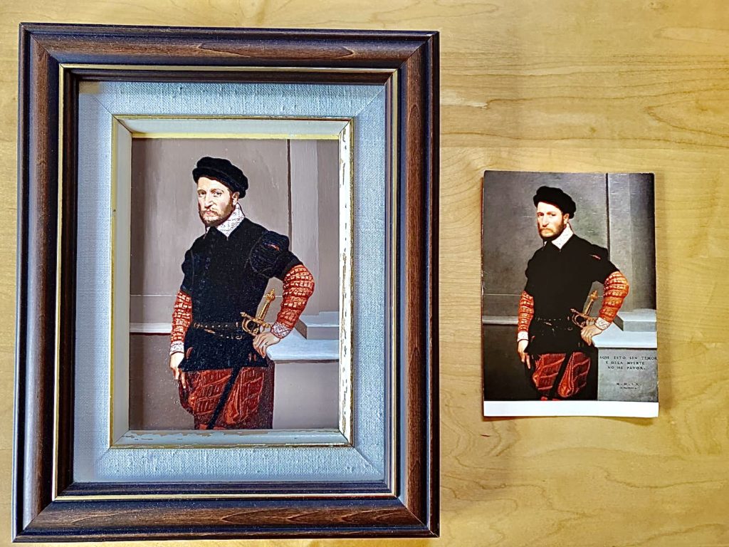
But something else in A Lake Near Copenhagen was not quite as it seemed. My father was a technician when it came to the paintings. A mathematician and operations research scientist by training and profession, he was extremely analytical. The pleasure in the hobby was not simply in the act of painting but it was also in analyzing the techniques and replicating exactly the colours and the brushwork. For real art forgers, technical skill alone is not enough, but it is essential to stay true to the artwork – deviation would give you away. I knew that my father took occasional and very small liberties in his replicas. For example, when I saw the original of Der Herzog von Alburquerque (The Duke of Alberquerque) by Giovanni Battista Moroni in Berlin, I noticed that my Dad had not included the inscription in the bottom right corner in his copy.
What my father did with The Lake Near Copenhagen was a whole different matter. I was very surprized to realize that the painting that hangs in the Danish national gallery has a totally different hue, strongly pink in the sky and especially the water, unlike the pale blues in my Dad’s image. When the frame was removed, it was discovered that Købke had originally painted those elements blue, using a pigment called Prussian Blue. Turns out Prussian Blue can have a nasty habit of turning red over time.
Re-imagining
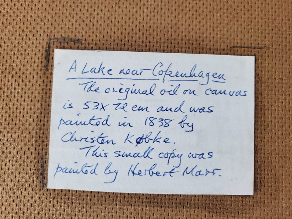
What really struck me was the timing of this discovery relative to when my father painted his copy. The discovery was made in 2014, long after my Dad had died. As recently as 2010, art critics and reviewers were waxing poetic about the sunset portrayed in A Lake Near Copenhagen:
Two figures on a pier are watching the same view as you: a little ferry gliding slowly across a river in late-afternoon light to the houses opposite, the smoke drifting from their chimneys a herald of home. The subsiding sun suffuses the water with colour, from pink to purple with a hundred nuances in between, tingeing the Danish flag on the end of the pier: the whole world is perfectly unified.
Source: https://www.theguardian.com/artanddesign/2010/mar/28/christen-kobke-master-of-light-review
The original still is pink and all the reproductions in art books that he would have seen are pink. With his passion for figuring out the specifics and nuances, would my father have guessed that the colour was not true, a conclusion that had eluded the experts at the time? He did not use the internet for his research, and I cannot access the technical books that he would have read about pigments and mixing colours. I did find an interesting reference to Prussian Blue in the wonderful book Colour: Travels through the Paintbox by Victoria Finlay, a book which my Dad had read and passed on to me. Nothing about fading to red, although apparently Prussian Blue is the source of the blueprint. I spent some time researching the pigment, finding few references to its changing colour. Indeed a number of famous paintings do not seem to have faded. Apparently what has faded is its popularity and especially its name. In 1958 Crayola changed the name of its Prussian Blue crayon to Midnight Blue.
With the exception of the water and sky colour, the copy in my home is a very good reproduction of A Lake Near Copenhagen. Maybe, somehow, my Dad knew that the reproductions in his art books were not true to what Købke had originally painted. I suspect not. I think that he like the painting very much, just not the colour and decided to improve it. I like it and prefer it to the original. I remain amazed at the scope of the change – very different from the impression that I always had that he only made a minor tinkering here and there with the paintings.
Now I am going to take a more careful look at the other paintings that I have hanging in my house and compare them to the originals. What else has my father modified? Maybe there are other which will take me on a similar journey to the one I enjoyed from A Lake Near Copenhagen.
Fun exploration. What a talent he was!
Yes, he sure was. Why I used to tease him about being a master forger. I have none of his artistic ability – just an appreciation for art!
Dear Ruth,
What an interesting story, especially for someone like me who was born and bred at the banks of lake Sortedam (meaning black pond).
I have learned about the colour change from a Danish engineering magazine years ago.
For many reasons you can no longer recognize lake Sortedam from the painting. Today the lake is reserved for bird life, so rowing is no longer permitted and thus a jetty also belongs in the past.
Rowing is popular many other places in and around Copenhagen, though.
Dear Anders,
Lovely to hear from you and I am so happy that you saw the post. Thank you very much for adding your story and connection to the lake. Oh, maybe my father did read about the colour – although not from a Danish engineering magazine!
I am very much looking forward to travelling again to Denmark one day, and this time I will row when I am there.
Kind regards,
Ruth
Wonderful, Ruth! When I did watercolours, I shared your father’s love of Prussian Blue. It’s hard to resist.
Thank you Gail. Now, there I learnt something else that I did not know before – that you used to paint watercolours! When restrictions lift you will have to come and see my copy of the painting.
For sure! Actually, I have a couple of my own forgeries hanging in my house — at the bottom of the stairs heading up to the second floor.
Excellent! I will have to take a look when I am next over.
What a lovely story and such rich memories and adventures your father has provided.
Thank you Jane. And yes, aptly put. I am lucky to have such rich memories.
What a fascinating inter-generational story!!
Thanks David!